A few months back I was contacted by a client who requested my help in the branding of their new fitness centers, Rock’n Fitness, a rock & roll themed fitness center which is opening in two locations in Boston. The client had seen the work I did for Rock & Brews and Floyds 99 Barbershop, so they initially asked me to design the logo.
Here is the final logo for Rock’n Fitness:
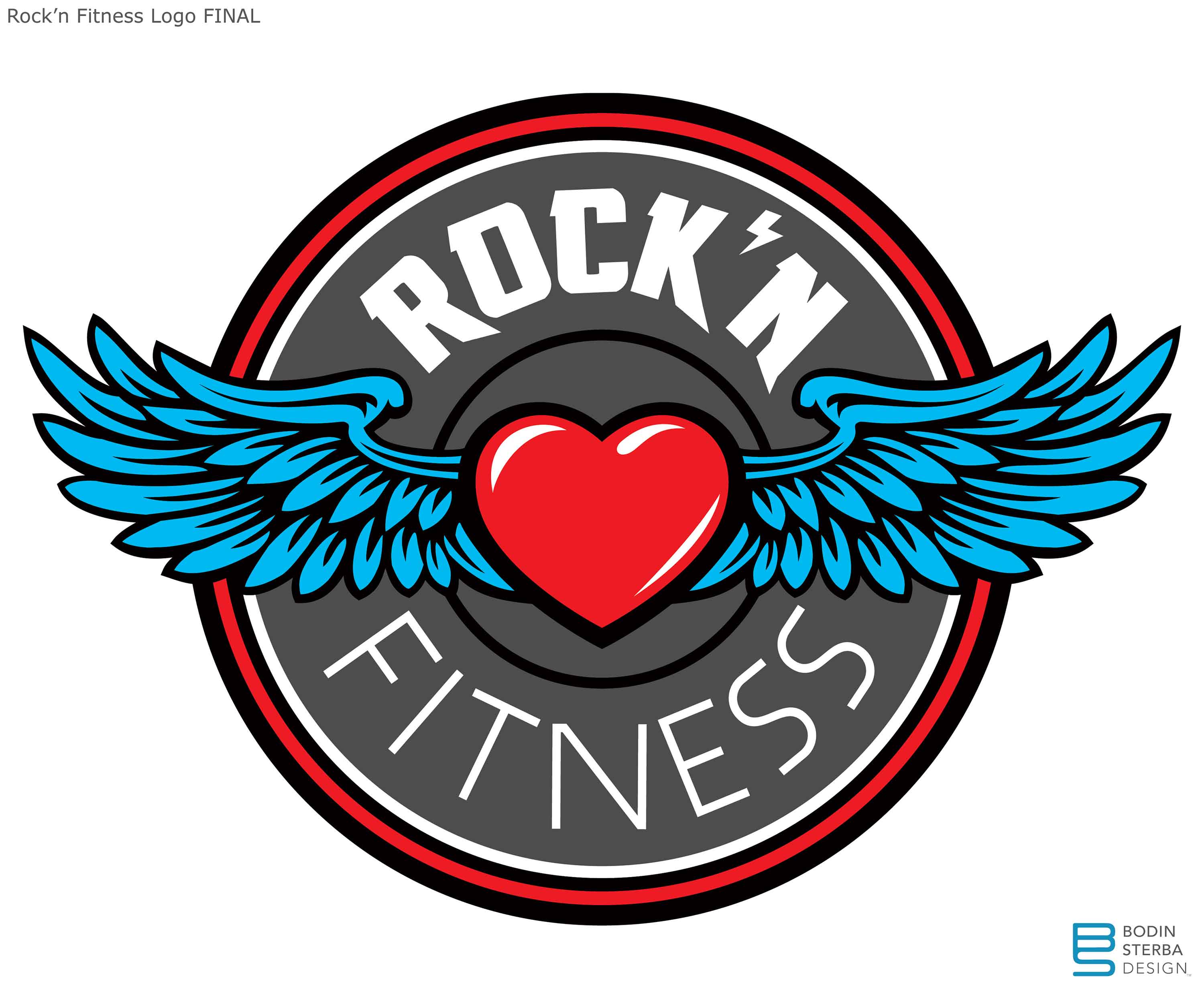
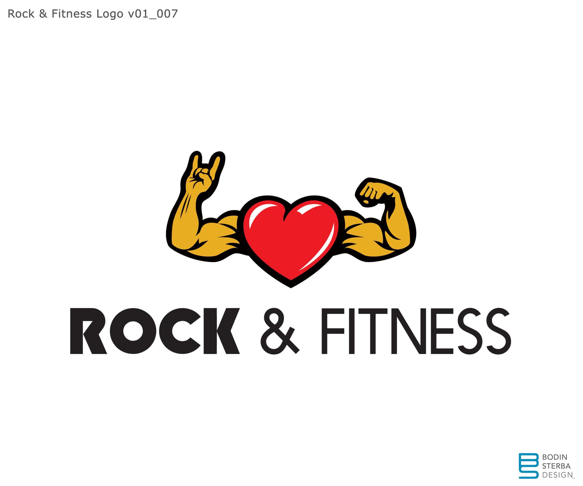
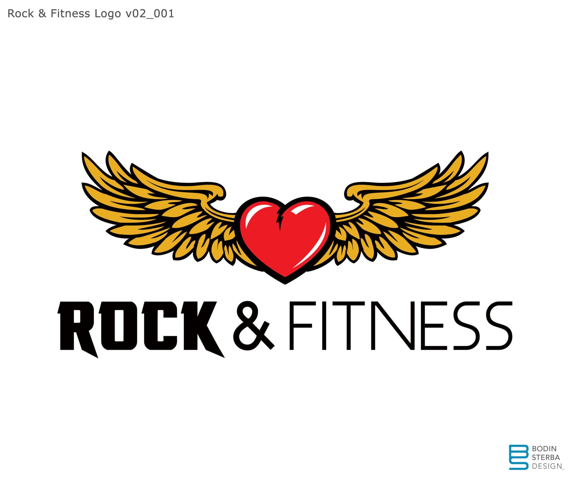
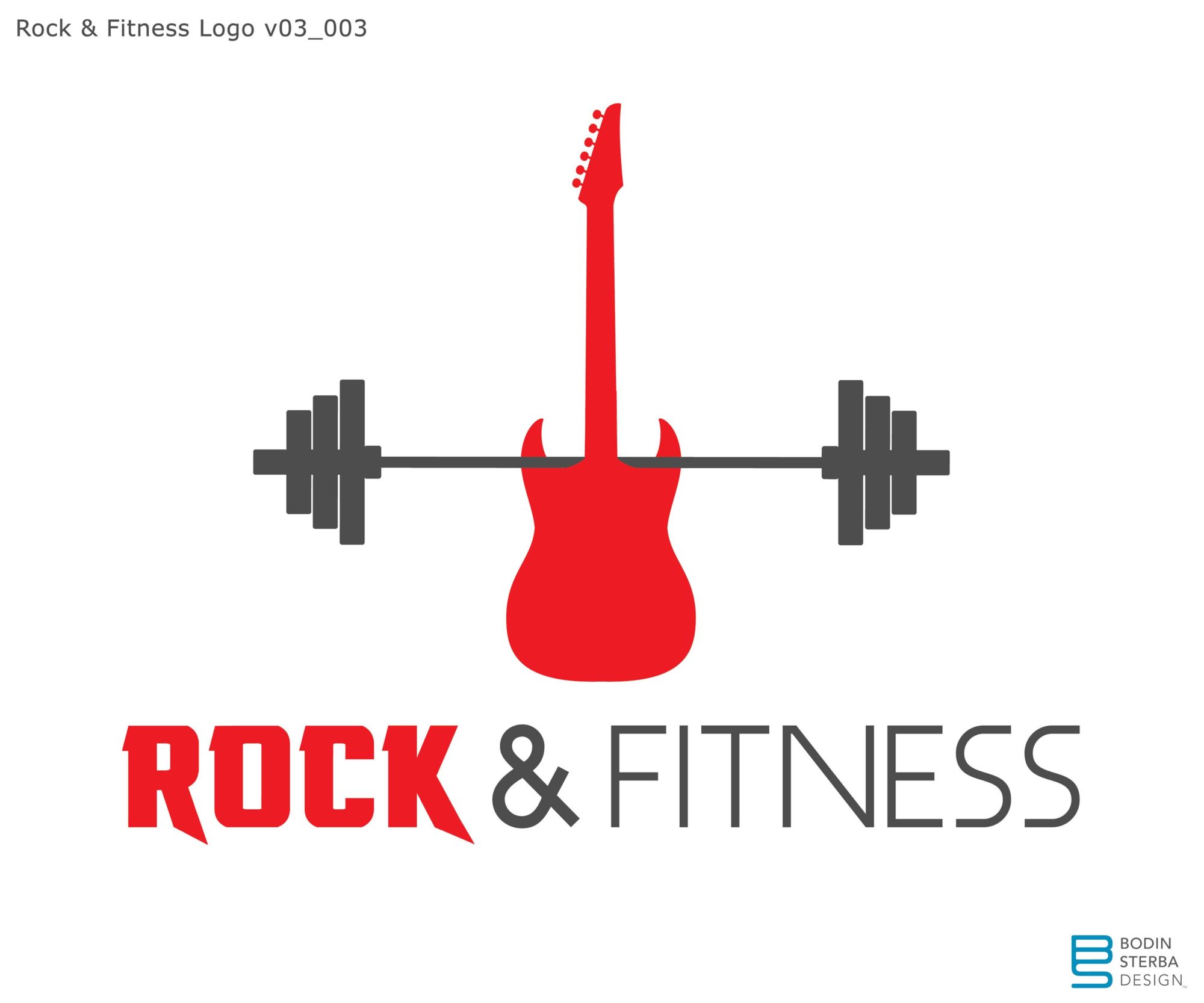
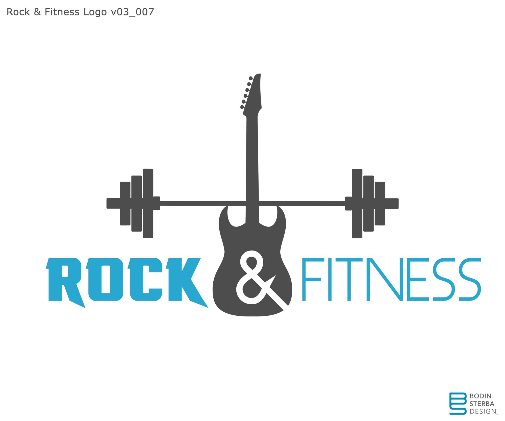
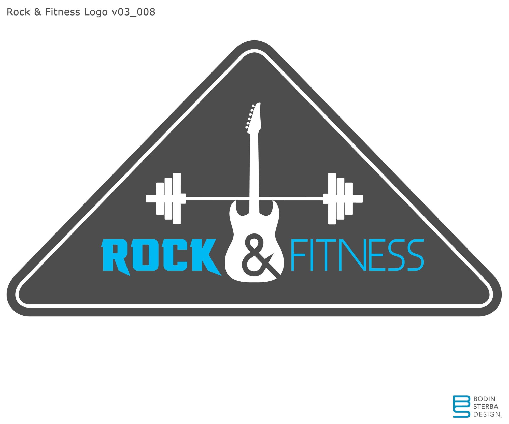
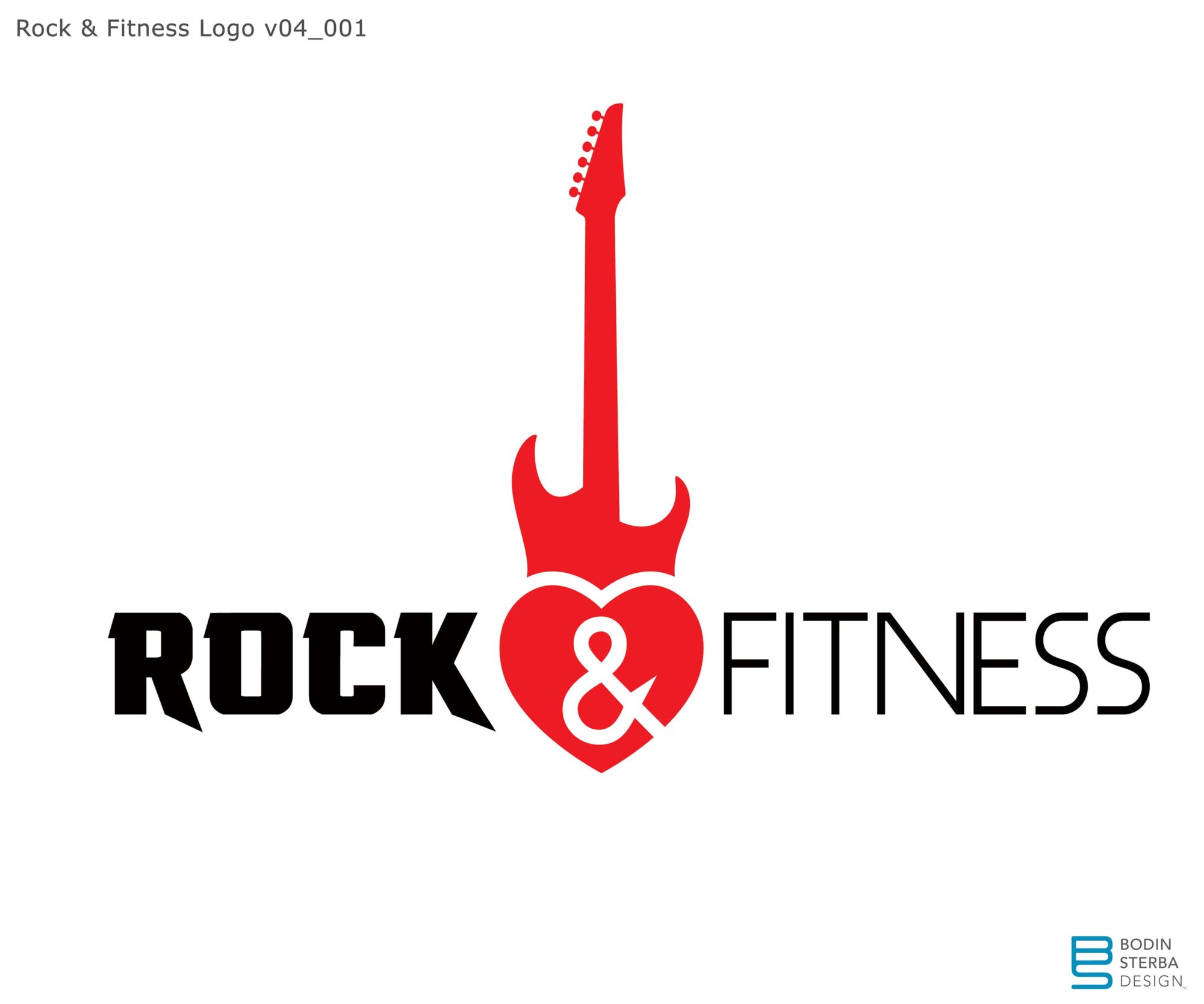
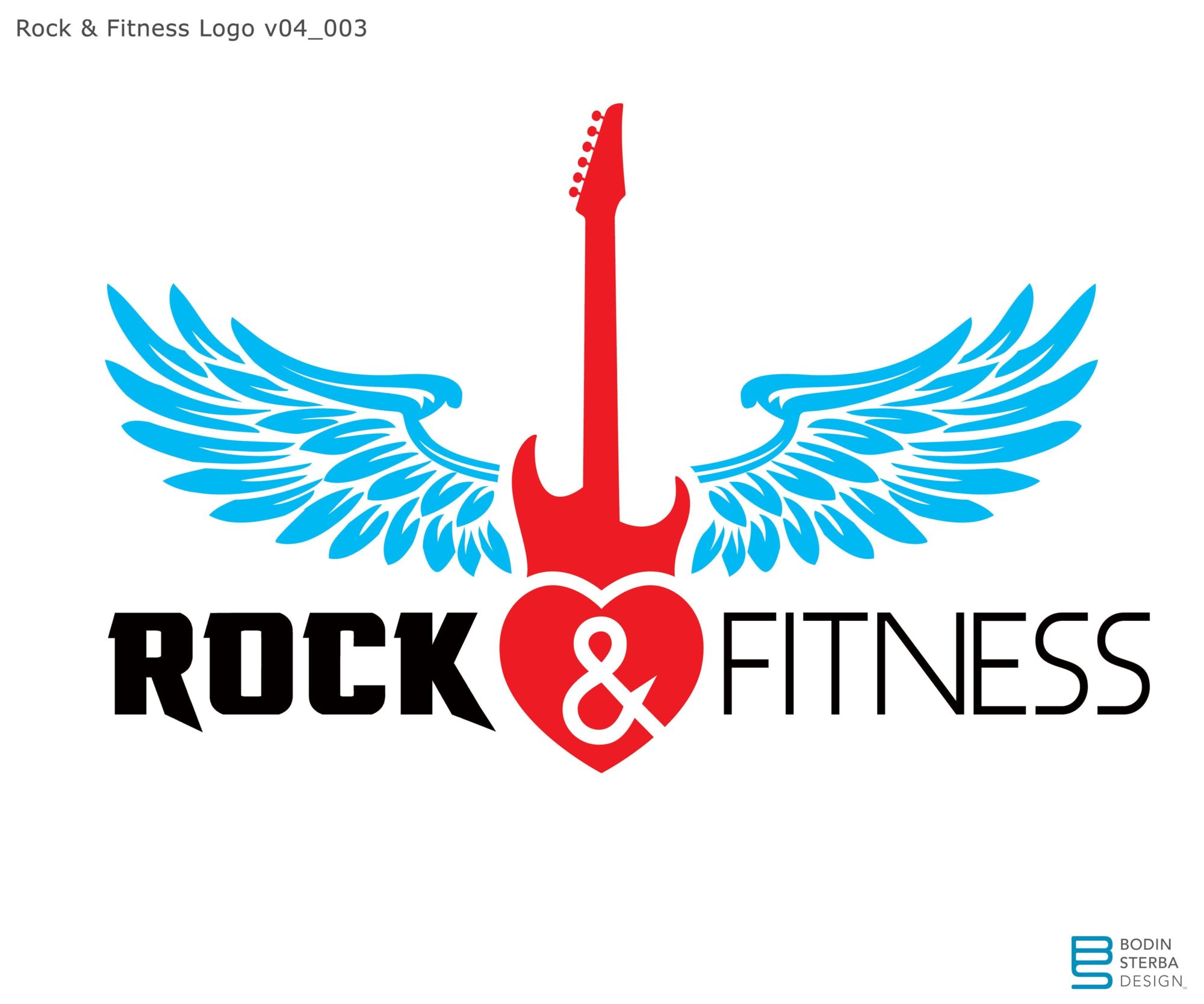
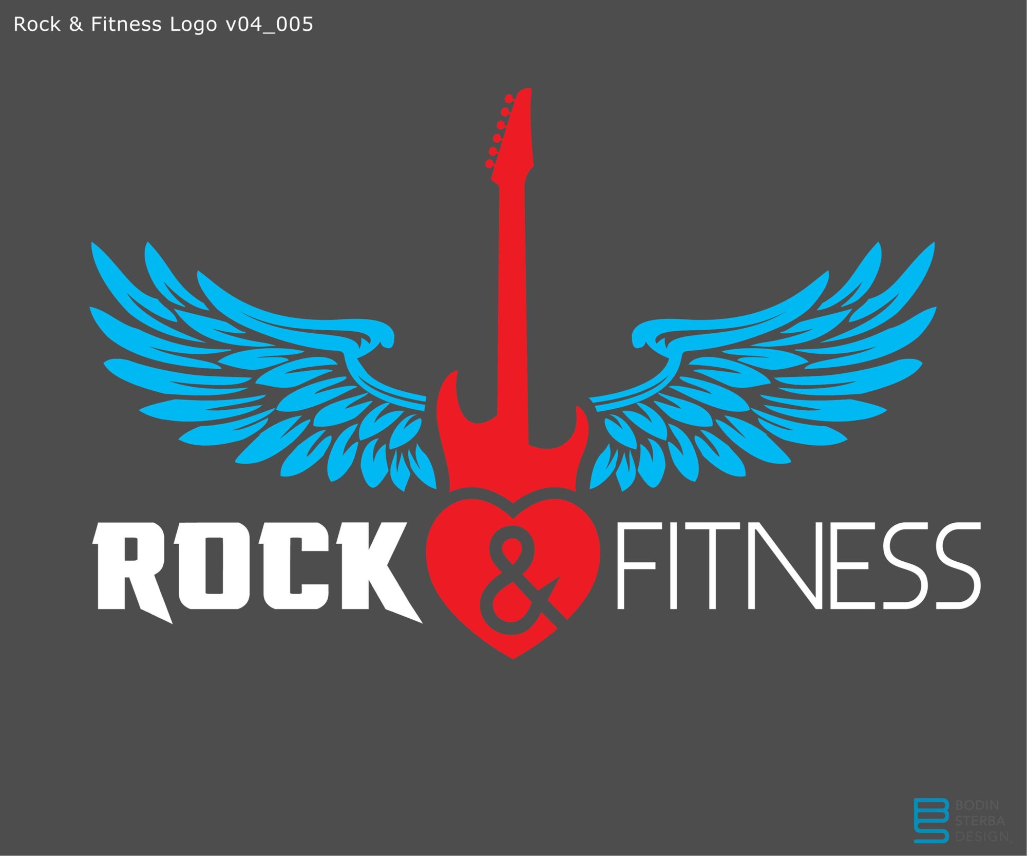
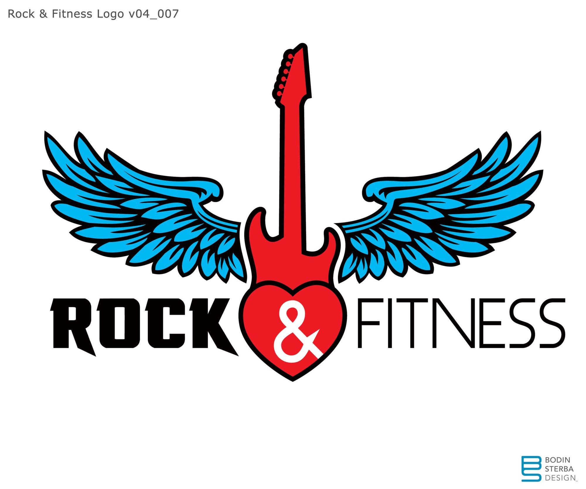
This is a gallery of some of the earlier versions of the logo. Personally, I liked the versions with the guitar, as they visually represented “rock” and “fitness”. The client opted to change the original name from “Rock & Fitness” to “Rock’n Fitness”, which eliminated the ampersand. They wanted a more classic circular logo, so that is the direction I went.
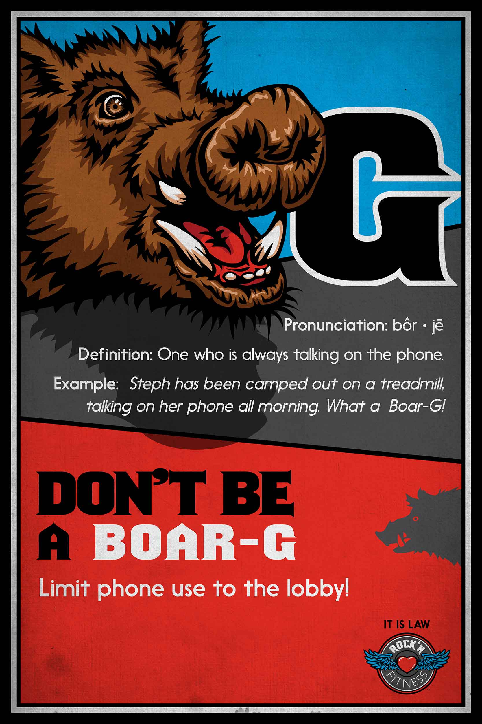
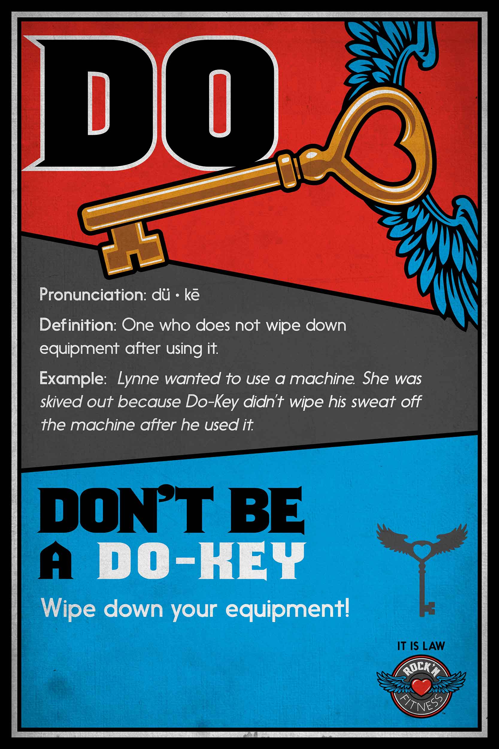
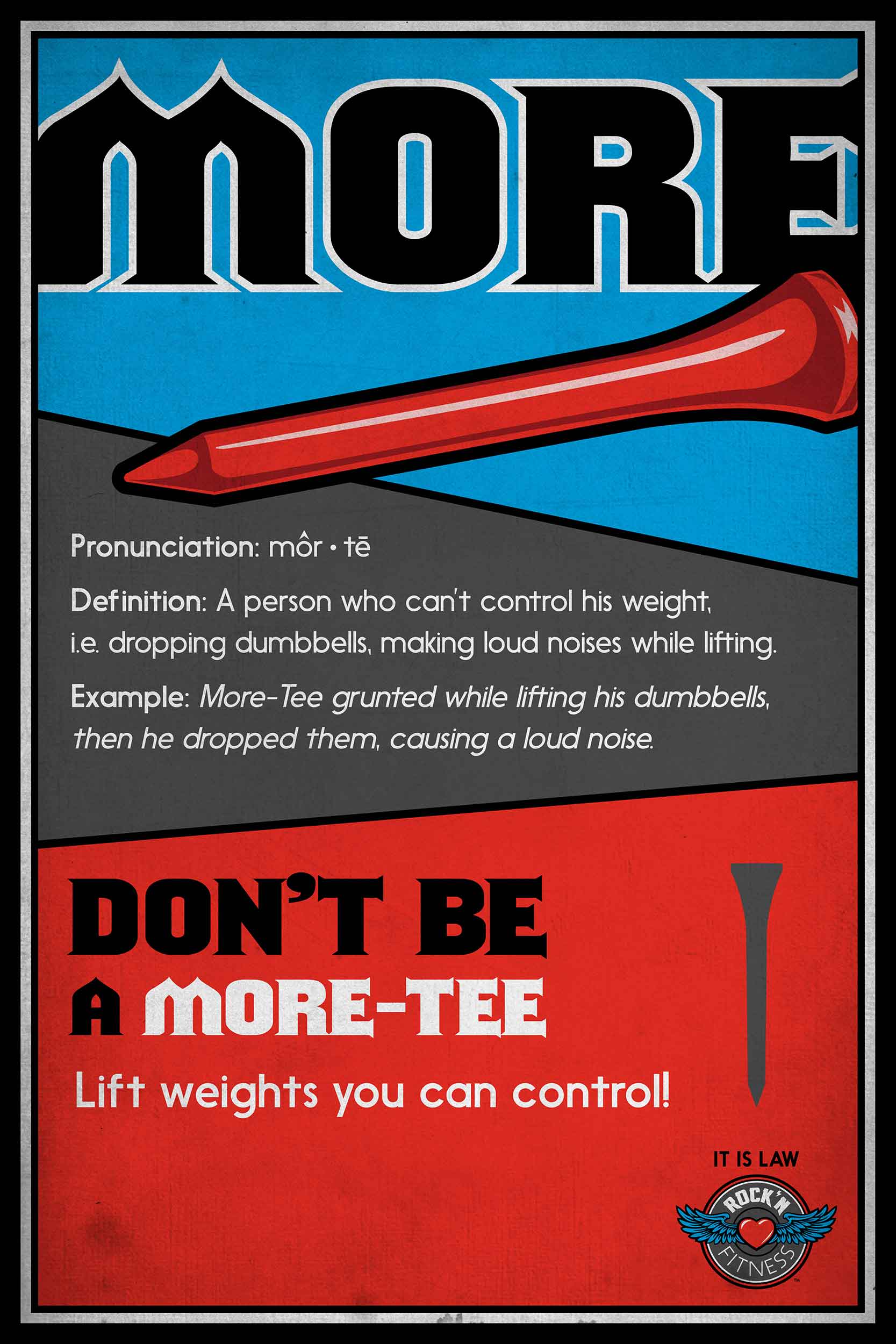
After seeing the logo develop, I was then asked to design the “rules” signs for the gym. The client came up with the quirky, and somewhat bizarre terminology and definitions, and I did my best to design the rest. Below is a gallery of the Rock’n Fitness rules signage: